In my previous posts (e.g. here and here) I showed how to use ps output (e.g. from ExaWatcher) visualization to spot performance problems in Linux. Here I’d like to show that this approach can be taken a little bit further, namely, to find the source of increase in memory usage.
The R code for this is quite straightforward. I also think it shouldn’t be much of a problem to do the same in Python, although I haven’t gotten around to try it myself. In the code below read_ps is the function that reads in a ps output file from ExaWatcher without unzipping it, sum_and_tidy does the aggregation, and visualize_rss does the plotting. There is also an auxillary function keep_top_n which is needed to keep the number of color bands to something reasonable.
library(stringr)
library(dplyr)
library(ggplot2)
library(lubridate)
library(plotly)
library(RColorBrewer)


read_ps <- function(dir= "C:\\Users\\savvnik\\work\\ExaWatcher\\ps",  fname = "2019_10_14_20_21_30_PsExaWatcher_myservername.dat.bz2")
{
  setwd(dir)
  con=bzfile(fname)
  lines <- readLines(con )
  server=gsub(x=fname, pattern="\\d\\d\\d\\d_\\d\\d_\\d\\d_\\d\\d_\\d\\d_\\d\\d_PsExaWatcher_(.*).uk.db.com.dat.bz2", replace='\\1')

  # identify lines that contain timestamps
  tstamp.idx <- grep('^   zzz  .*$', lines)
  # identify lines that contain data
  data.idx <- grep('^(\\S*\\s){16}.*$', lines)
  # match data entries to timestamp entries
  i <- findInterval(data.idx, tstamp.idx)
  # parse data entries
  s <- str_match(lines[data.idx], pattern="^(\\S+)\\s+(\\S+)\\s+(\\S+)\\s+(\\S+)\\s+(\\S+)\\s+(\\S+)\\s+(\\S+)\\s+(\\S+)\\s+(\\S+)\\s+(\\S+)\\s+(\\S+)\\s+(\\S+)\\s+(\\S+)\\s+(\\S+)\\s+(\\S+)\\s+(\\S+)\\s+(.*)$")
  # remove the first entry which is the header
  s <- s[,-1]
  # convert to a data frame
  df <- as.data.frame(s, stringsAsFactors=F)
  # get the timestamp entries and parse them using regex
  t <- lines[tstamp.idx[i]]
  tstamp <- gsub(pattern='^\\s*zzz  subcount: \\d*$', x=t, replacement='\\1')
  # give meaningful names to the columns
  colnames(df) <- c('F', 'S', 'RUSER', 'PID', 'PPID', 'C', 'PSR', 'PRI', 'NI', 'ADDR', 'RSS', 'SZ', 'WCHAN', 'STIME', 'TT', 'TIME', 'CMD')
  # add the timestamp
  df <- cbind(df[-1,],tstamp)
  df <- df[-1,]
  df % mutate(tstamp=mdy_hms(tstamp))
  df % mutate(server=server, ps0=gsub(x=CMD, pattern='\\d', replace="")) %>% mutate(ps0=substr(ps0, 1, 20))
  return(df)
}

sum_and_tidy <- function(df, groupbycol="ps0"){
  # group by, calculate sum and then ungroup
  d %  group_by_at(c("tstamp", groupbycol)) %>% summarize(x=sum(as.numeric(as.character(RSS)))) %>% select(c("tstamp", "x", groupbycol)) %>% ungroup %>%
    # take care of NA values to prevent breaks in the graph
    tidyr::spread(key = groupbycol, value = x, fill = 0) %>%
    tidyr::gather(key = groupbycol, value = x, - tstamp) %>%
    # order by timestamp and factor columns
    arrange(tstamp, groupbycol)
  # restore the name of the grouping column from the autogenerated one
  colnames(d)[2] <- groupbycol
  return(d)
}

keep_top_n <- function(df, topn, label='other'){
  df <- as.data.frame(df)
  # save column names
  col.names <- colnames(df)
  # convert 2nd column to factor if it's not already
  df[,2] <- as.factor(df[,2])
  # get the list of top values
  top.values % group_by_at(colnames(df)[2]) %>% summarize(x=sum(x)) %>% arrange(desc(x)) %>% head(topn) %>% pull(colnames(df)[2])
  # merge all other values as 'others'
  levels(df[,2])[!levels(df[,2]) %in% top.values] <- 'other'
  result % group_by_at(c(colnames(df)[1], colnames(df)[2])) %>% summarize(x=sum(x, na.rm=T))
  print(colnames(result))
  colnames(result) <- col.names
  return(result)
}

visualize_rss <- function(df, n=10, basepalette='Dark2'){
  cols <- colorRampPalette(brewer.pal(8, basepalette))
  mycols % sum_and_tidy %>% keep_top_n(n) %>% ggplot(aes(x=tstamp,y=x)) + geom_area(aes(fill=ps0, color=ps0)) + scale_fill_manual(values=mycols)
}
The basic idea is to use the same stacked area plot used for OEM-style wait class visualization, but instead of average active sessions, the width of a band would represent the resident memory usaged by the process at that particular time. Since the number of processes can easily reach thousands, and stacked area graphs become unreadable beyond 20-30 colors, I use grouping and merging: i.e. I group similar processes together, and I merge all processes outside top-N into one group (“others”). There may be different ways of grouping processes, I simply strip all the digits from the processes’ command (CMD in ps output), so e.g. all foreground Oracle processes will become just one band, but for background processes you would still be able to differentiate between different types of background processes (e.g. LGWR vs DBW), but not the individual processes within a group. I also truncate CMD to 20-30 characters because otherwise the legend will take up most of the graph.
The resulting plot gives a general idea of how memory usage is distributed between various process groups. Strictly speaking, it’s not always going to be accurate, since rss can include shared memory, but from my experience it’s accurate enough to help understand the changes in memory usage in most cases.
Here is a simple example how it works. Below are a couple of graphs illustrating a massive performance issue (which ended up in a node eviction). The first one shows free memory from a performance-monitoring grafana-based internal portal, along with swapping stats.
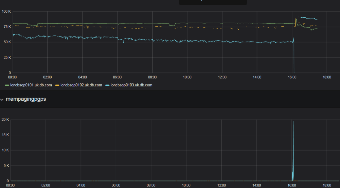
We can clearly see some serious memory issues here — free memory goes down, and then there is a big spike in swapping. Now let’s use the code above to parse ExaWatcher.ps and visualize its contents:
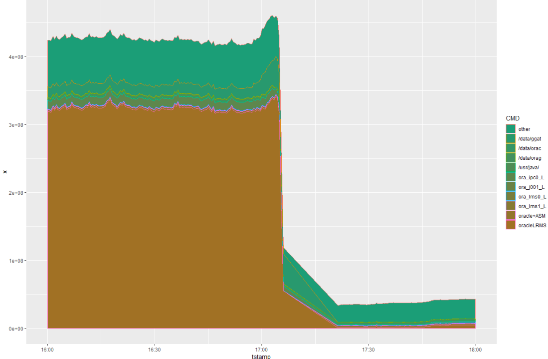
We can see a bump (memory usage increases in the build-up to the issue) followed by a rapid fall (things getting shut down because of memory eviction). It seems that the bump is mostly due to GoldenGate processes (/data/ggat). To be sure, let’s filter out just GoldenGate processes (e.g. using filter(…,grepl(CMD, pattern=’ggat’)):
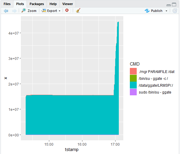
which confirms our suspicions. Also, with filtering we can more easily appreciate the size of the increase (about 30GB).
As it turned out, the problem was the result of the previous failover which caused the busiest database instance to share the node with GoldenGate processes. Another component of the problem was the increased appetite of GoldenGate with regards to memory following the 18c upgrade. Finally, there was a big lag in GoldenGate due to its earlier problems, which may also have contributed to its rate of memory usage.
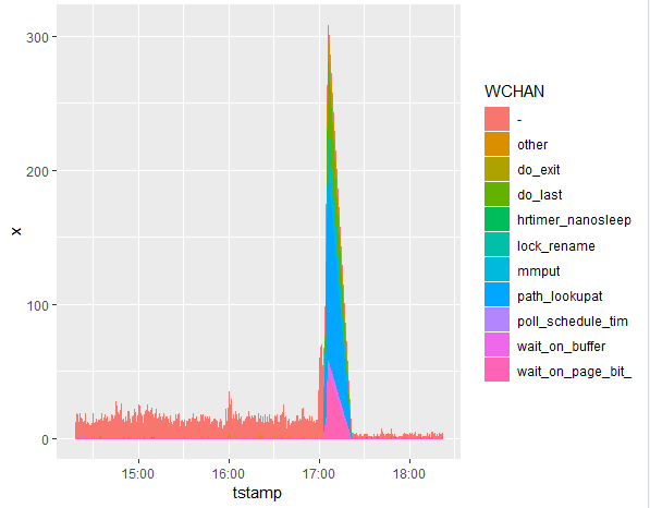
It is also instructive to look at the wchan graph, where one can see many processes waiting on path_lookupat, which I’m guessing is the impact of file cache depletion. The reason I’m finding this interesting is that it illustrates what kind of impact you might encounter when flushing caches on the OS level, which is a popular workaround for memory fragmentation issues. Based on this, looks like it can actually cause some rather nasty side effects in terms of performance of file I/O operations.