A few illustrations of patterns to look for when using Wireshark to understand poor network performance. I’ve already touched upon this topic in the past, but this time I just want to share a couple of screenshots with a few comments.
This is an example of graph in Statistics -> TCP Stream Graphs -> Round Trip Time menu for a network packet capture of slow Data Guard traffic.
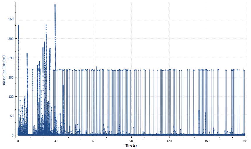
Before we go any further, let me clarify that the term “round trip time” is not very accurate here, as it does not characterise the time taken by a packet to travel its destination and back, but can also include various server-side delays.
Now let’s look at the graph. You can roughly split it into two big areas: first 30-40 seconds, and the rest. Let’s start with “the rest”. It looks like a forest with a bunch of “trees” of approximately 200 ms height, and some substrate of “grass and bushes” of much lower height (from a few ms to a few tens of ms). What’s the significance of 200 ms? It’s default value of TCP retransmission timeout (RTO) in Linux which basically tells you how long TCP waits until resending a packet if it fails to receive an ACK on time.
So the number of “trees” on this picture tells you how many timeout-based retransmissions you have in the capture. There are other kinds of retransmissions (e.g. so called “fast retransmissions” based on a certain number of duplicate ACKs), but they can be triggered by things other than packet loss (for example, out-of-order arrival over parallel network paths).
What about the first 30-40 seconds area? The height of the “trees” varies, and it looks like it varies slowly and in patterns, not just randomly. If we zoom in, we’ll see a bunch of dents each looking like this:
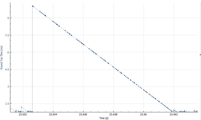
Now that’s interesting. Not only the shape is almost an ideal straight line, but also it’s slope is almost exactly 45 degrees if you plot it to scale. This means that the packets are being accumulated somewhere in the network, and then released all at once — evidence of either traffic shaping, or intermittent malfunction of one of the links.
And another graph — Statistics -> TCP Stream Graphs -> Window Scaling.
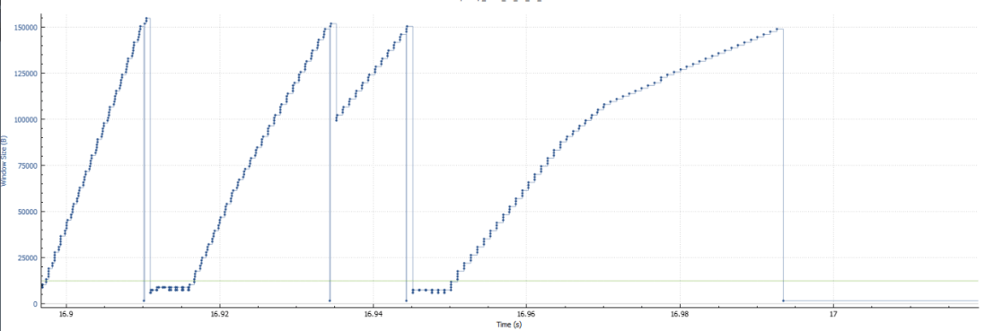
To put it simply, TCP congestion window is the number of packets in-flight at any given moment in time. When TCP encounters what it interprets as a “congestion event” (such as a series of duplicate ACKs), it responds by reducing the window to avoid making the congestion worse.
When packet loss is low, you would expect to see the window scaling graph to look differently: with peaks less regularly shaped and clustered around much higher values. That is because you are sending everything you have to send — when there’s little data for the application to transfer, the congestion window may look small, but as soon as data appears, transmission scales up very quickly.
On a lossy network, congestion window changes slowly, in smooth patterns, and frequently stays at very low values, at times dropping to values as low as 4 MSS (e.g. 1460×4=5840 bytes for MSS=1460).
This should hopefully give some insight into how packet loss translates into slow performance for reliable data transfer protocols like TCP. When people talk about loss of performance due to transmits, they sometimes imagine time being wasted not sending the data waiting for ACKs. In reality, however, it’s a relatively small effect. In this capture, the number of timeout-based retransmits is something about 100 — multiply it by typical timeout of 200ms, and you get that you spent about 20 out of 180 seconds in timeouts, i.e. that accounts for just 10% loss of the performance.
The indirect consequence of retransmissions can be much higher than that. For example, when the congestion window drops to 4 MSS, assuming 1460 MSS, and 1 ms latency, this means that you can only send 5840 bytes of data before receiving ACKs, which would take 1 ms, i.e. your throughput is limited to 6 MB/s — if you’re on 10+ Gbit/s network and you are using a significant part of the bandwidth, this will have a devastating effect on the application (and/or the database). Over time, the congestion window will grow, but the next congestion event will cause it to shrink again (the exact new value depending on the nature of the event). This is the mechanism behind the so-called Mathis equation (throughput < MSS/sqrt(p)/RTT, where p is packet loss).
