Introduction
If you work with I/O benchmarking of Oracle databases, you are almost certainly familiar with SLOB. SLOB is more than just an I/O benchmark — it’s become a de-facto industry standard. It’s simple, powerful and efficient, and it captures a plethora of metrics, both from the OS (output of iostat, mpstat etc.) and the database itself (in the form of an AWR report).
One thing that is missing though is visualization. It’s fairly easy to fix using an external plotting tool (like gnuplot or R), but what data would you plot? AWR only gives you average event times and histograms with ridiculously poor resolution. And if you want to see a high-resolution picture of your I/O (and you do — I’ll discuss the importance of that later on), it’s not enough.
SLOB HD
Fortunately, that is also not too difficult to fix. I wrote a simple add-on to SLOB that allows to produce very detailed plots of I/O distribution times. It consists of two shell scripts (and a gnuplot used for the actual plotting). You sandwich runit.sh execution between the shell scripts:
./slobhd_start.sh
./runit <number of threads>
./slobhd_end.sh
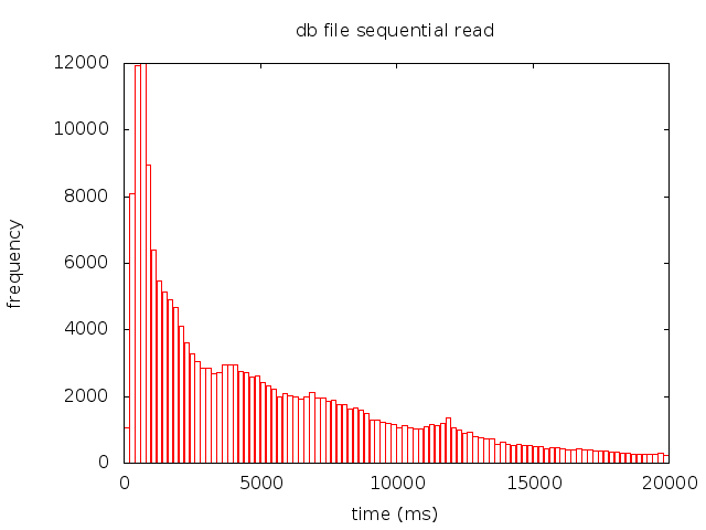
and you get a png file with the histogram that looks something like that:
How does that work?
It’s all very simple. All the first script does is enable database-level tracing and touches a temporary file to record the timestamp of the run start (so that you’d know which trace files were produced by the most recent SLOB run):
sqlplus -s / as sysdba << EOF
exec dbms_monitor.database_trace_enable;
EOF
touch run_start.tmp
The second script does a little bit more work, but it’s fairly simple as well:
function tracename()
{
  sqlplus -s / as sysdba << EOF
  set heading off
  select value from v\$diag_info where name = 'Diag Trace';
EOF
}

sqlplus -s / as sysdba << EOF
exec dbms_monitor.database_trace_disable
EOF
trc=$(tracename | tr -d '\n')
find $trc -newer run_start.tmp -name "*.trc" | xargs grep 'db file sequential read' | sed -r 's/.* ela= (\w*) .* tim=(\w*)/\1 \2/g' > seq_hist.txt
gnuplot plot_seq_times.gpl
As you can see, it turns off the tracing, finds all resulting trace files (querying v$diag_info to determine the directory where they are located), then extracts elapsed times for db file sequential read events using grep and sed, writes it to a text file and plots its contents using a gnuplot script:
set terminal png enhanced
set output "seq.png";
set xlabel "time (ms)"
set ylabel "frequency"
set title "db file sequential read"
set xrange [0:20000]

n = 100
min = 0
max = 20000
width=(max-min)/n
hist(x,width)=width*floor(x/width)+width/2.0
set boxwidth width*0.9

plot "seq_hist.txt" u (hist($1,width)):(1.0) smooth freq w boxes notitle
Note that you may need to adjust the x range — I had to set it manually because a few outliers distorted the horizontal scale so that it would be difficult to see anything useful. Also, you may want to change the number of histogram bins either way — how many bins you can afford to have depends on how many events you have — if you don’t have enough statistics, then the statistical error would cancel the high resolution provided by the large number of bins, so you need to find the right balance. The statistical error is of the order of inverse square root of N, where N is the number of elements in a bin, so ideally you would want at least a few thousand counts per bin.
What’s so great about those high-resolution plots?
Why is good resolution so important? Because database I/O is a complex thing that cannot be described with just one or a few numbers. You need to be able to see the shape of the distribution to really understand what’s going on.
For example, you see that your average random I/O is taking too long — but what is causing it? Is it just some outliers pushing the average upwards? Is the entire distribution symmetrically shifted to the higher side? Or is there a secondary peak of some nature? Knowing this can help a great deal towards finding the answer to the problem.
In most cases I/O subsystems have several distinct scales: e.g. you can have a group of ultra-fast events due to filesystem cache, then another group in sub-millisecond range (storage cache), and finally the third group that describes the actual physical reads (e.g. http://datavirtualizer.com/oracle-physical-io-not-always-physical/). So a single average numbers is just the result of a mixture between all these different scales, and doesn’t tell you much. AWR histograms contain a bit more information, but their resolution is way too coarse: for example, there are no bins between 32ms and 1s, or between 0 and 1 ms.
If you can see the distribution times in high resolution, you can see how all these scales interact to produce the observed I/O effects, and clearly see positions and widths of all peaks, as well as any anomalies that may indicate bandwidth saturation or hardware problems.
Outlook
It’s fairly easy to take this approach one step further and use it for doing other things, e.g. looking at redo write times (log file parallel write event) or multiblock reads (db file parallel read, db file scattered read, direct path read). And it doesn’t have to be just the frequency histograms: for instance, it could be useful too look at correlation between event durations and the number of I/O requests or blocks processed (p2/p3 event parameters), e.g. in a form of a heat map. Such plots would be more convenient to produce in a more advanced program like R.
Another possible usage is to plot results from a series of runs on the same graph (i.e. a 2d plot showing how I/O times change as the number of threads increases). Or one could plot I/O durations versus time to spot any patterns here etc.
Summary
SLOB is an awesome tool for benchmarking Oracle database I/O performance. Hi definition histograms using database-level tracing can help us extract more value from it and see things we could never see with coarse AWR histograms.
Update
Stefan Koehler has pointed out to me that 12c event histograms improved resolution with respect to 11g. There is some truth to that: 12c event histograms now covers 0-1 ms region. However, in my opinion, this changes very little, and using tracing is still the right way to go in 12c:
1. 12c “high-resolution” histograms are not externalized through AWR. Rather, they are accessible via V$EVENT_HISTOGRAM_MICRO view. This means that if you want to use these data for plotting, you’d need to write some code for capturing the start snapshot, storing it somewhere, reading it back and then calculating the diffs. E.g. Luca Canali’s script has 171 lines. Enabling tracing, on the other hand, is just 1 line of code, and extracting times from the trace files — just a few more lines.
2. V$EVENT_HISTOGRAM_MICRO
V$EVENT_HISTOGRAM_MICRO doesn’t really provide a high-resolution picture, as it only has 25 bins (for comparison, my example above has 100). That’s the same as difference between SD and HD, or HD and UltraHD in television! Note that if you’re producing the histograms yourself, you have the complete control, and you don’t have to stop at 100 bins. For example, a SAN array with 20k IOPS would give you 6M samples for a standard 5 min SLOB run, which would give you enough data to build a histogram with 1,000 bins with statistical accuracy of about 1% for most bins!
You can also hand-pick your bins to emphasize the regions of most interest (although in this case you’d probably want to use R instead of gnuplot).

Nikolay,
very interesting!
I wonder, have you measured impact on IO from turning trace ON?
Hi Alexandro,
thanks for your comment. No, I haven’t had a chance to measure it. I think that the exact size of the effect would depend on the details of the setup, but in most cases it should be fairly small.
Having a standard (i.e. no tracing) SLOB run should provide a baseline for estimating the size of the effect.
Best regards,
Nikolay